

Munch has always been a playful, mass-market chocolate wafer brand loved across India. But Nestlé saw a new opportunity — to evolve Munch into a more premium, indulgent variant: Munch Max.
The challenge was ambitious: how do you transform a familiar favorite into a premium hero without losing its core identity? How do you craft branding and marketing that appeals to loyal fans and excites new audiences craving something 'extra'?
That’s where Prakria, a top creative agency and trusted branding consultant, stepped in. With expertise in brand building, brand strategy, and creative logo design, we helped Munch Max carve out a bold new identity.
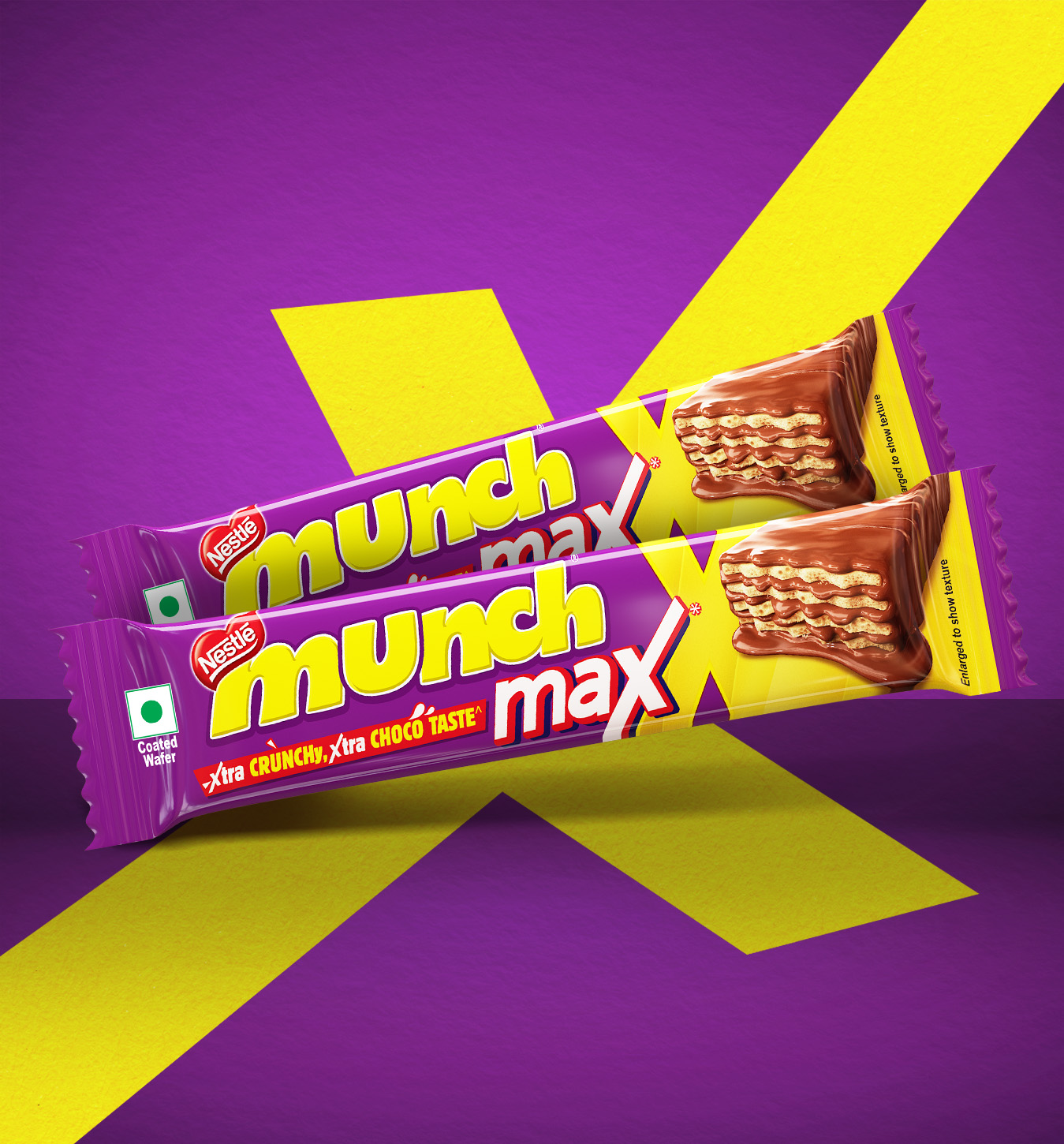
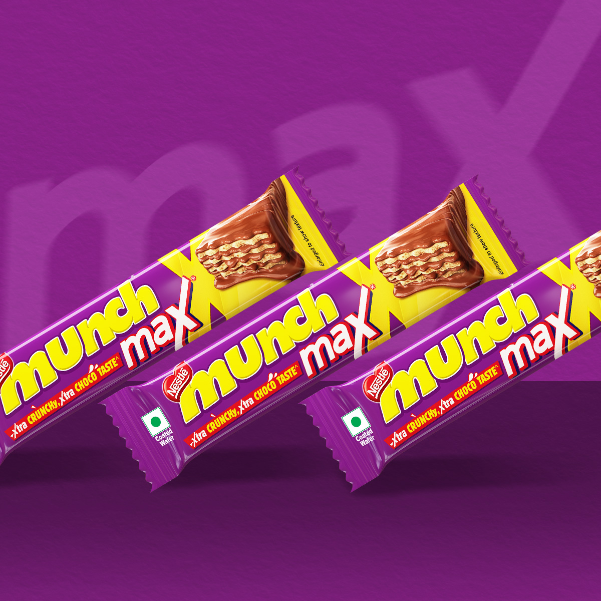
MUNCH was a familiar, mass-market chocolate bar, but when the time came to launch a bold, premium “chunky bar” version under the name MUNCH MAX, things needed to shift.
MUNCH had long been positioned as a mass-brand, so moving into the premium category posed a brand perception risk.
The product needed to signal “premium” in a clear, immediate way, through name, design, and format, rather than simply being a variant.
It had to solidify its market position and break through into the premium segment while retaining core brand equity.
The packaging, identity and naming all needed to align around the product’s “max” size/impact to justify the premium positioning.
In essence, the challenge was to elevate MUNCH into a premium league without losing what made the brand loved,turning a familiar bar into something bold, “maxed” and aspirational
We identified a clear gap, Munch Max needed to feel bolder and richer, yet stay true to the playful energy of Munch.
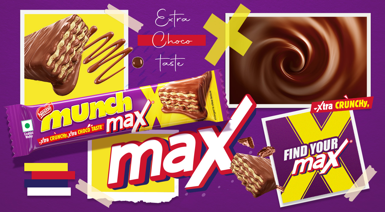
The name “Munch Max” was crafted to be short, punchy, and clear. Max captured the promise of more chocolate, more texture, more indulgence and a simple, powerful statement of intent.
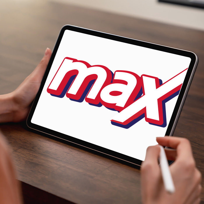
The “X” became the hero, a dynamic smash mark symbolizing intensity and energy, anchoring all brand communication.
Across packaging, retail, and campaign visuals, the design expressed a premium yet playful identity, merging storytelling with striking visual impact.
A bold, cohesive brand that redefined Munch for a new generation max in taste, max in attitude.
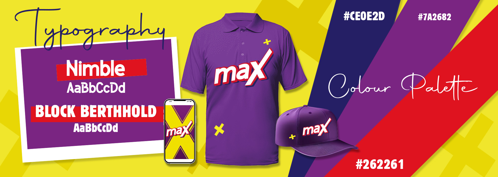
We established Munch Max as a sub-premium brand under Munch, employing robust motifs and powerful typography to convey a change in experience.
The "X" took center stage of the logo, transforming a letter into a unique, memorable icon of "extra."
Campaigns revolved around the idea of “max” — more indulgence, more punch, more fun. This ensured that messaging was consistent across retail, digital, and outdoor.
The mark was created with flexibility in mind, flowing effortlessly across single bars, multipacks, shelf units, and digital assets.
With powerful visual language, we provided breakaway visibility in crowded shopping environments and compelling storytelling on the web.
Beyond just visuals, we crafted an emotional story around Munch Max — making it feel like a bold evolution of a beloved favorite rather than a detached product line.
The Munch Max launch stood out in multiple ways:
Consumers noticed the difference. The bold “X” identity made packs instantly recognizable on shelves.
Younger audiences connected with the edgier, more indulgent tone.
Loyal Munch fans appreciated the premium upgrade without losing the original brand’s charm.
Retailers reported stronger visibility and brand recall, noting that Munch Max stood out from competitors like KitKat and Cadbury.
On digital platforms, the visual language became instantly shareable, supporting organic buzz and brand promotion.
The branding and marketing strategy didn’t just elevate the product, it re-energized the entire Munch portfolio.
Munch Max is a clear example of how thoughtful branding strategy, design, and storytelling can transform a familiar brand.
Brand building companies create not just logos, but narratives that people remember.
Creative marketing agencies turn strategy into compelling experiences.
Strong brand communication & strategy builds bridges between heritage and innovation.
Best branding work balances visual impact with strategic depth.
At Prakria, we see branding as more than aesthetics. It’s the face of the brand, the first handshake with consumers, and often the reason someone chooses to engage.
Do you have a project in mind? Regarding Digital Marketing, Packaging Design, Branding, Print Media, 3D & CGI, AR/VR & Game Tech, films, animation & VFX, Illustration, Web Development, AI design—really any of our blend of creative services—we can help. Call us at our multimedia 360° marketing agency, animation studio, web development company, or video production house - we can't wait to team up.
At PRAKRIA, we don’t simply make visuals—we create connections of people to the thoughts through experiences.