
Dabur is known to be a brand that always walks the talk of Tradition. But with Dabur Baby they wanted to do something different. They wanted to reach out to millennial moms, young moms, and create a brand identity that reaches out to them.
It was a tricky challenge. And Dabur wanted an agency that can take tricky challenges and come back with solutions in incredible time. Though Dabur has its legacy of amazing products, it always struggled with appealing to the more urbane, younger, millennial audience. The ask was to take the Traditional Dabur legacy forward in a manner that appeals to the modern Mom.
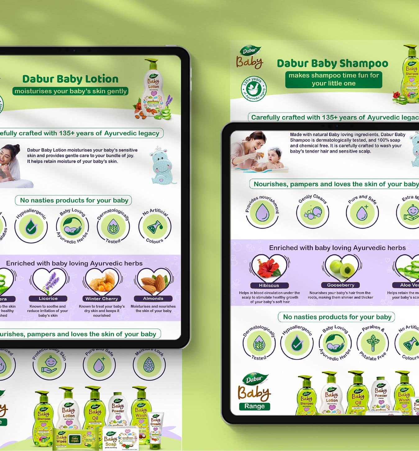
Since the Dabur Baby range was going to be a completely Digital Launch, we took a platform-first approach and decided the Pack Aesthetic based on the medium where it will sell.
Our idea was to take the ingredients as the core; as the center of our design strategy, and explore around it in a manner that will appeal to the millennial moms. Ingredients that capture the Dabur Legacy, and a design language that used contemporary color palettes: pastel green, white, cream, etc., to give a modern aesthetic to the pack.
Traditional ingredients, Modern outlook. That was what the final pack communicated. Checkmate, you challenge. And Checkmate in almost no time. The range was extended to Dabur Baby diapers, and we did all the digital release with time to spare.